We renovated this cottage for our clients' mom to live in for aging-in-place. This fun project has reinvigorated our interest in universal design and aging in place. Hope you enjoy our video!
12/11/12
Watch Our 8 Week Cottage Makeover
We renovated this cottage for our clients' mom to live in for aging-in-place. This fun project has reinvigorated our interest in universal design and aging in place. Hope you enjoy our video!
11/19/12
Wonderful New Take on Hex Tile
11/15/12
Dining By Design Event
Dining by Design at the Galleria in the Design Center benefits aids research and it's always a fun way to see all our friends, tour some fun tabletop design and support a great cause. Here are some pics from last night:
 |
| Wonderful high tech exhibit with color changing LED's! |
 |
| Love the capiz shells and sunflowers! |
 |
| Studio Hatch-Great exhibit! |
 |
| Design Center Glitterati with "Tippy Hedron" |
 |
| Jonathan Adler Design |
11/13/12
Check Out Iconichouses.org!
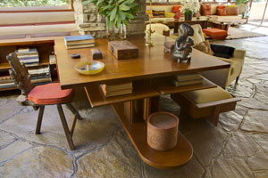
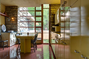
One of my favorite photographers, Ken Gutmaker, sent me a link to this amazing website. Anyone who loves houses will love this site, iconichouses.org. How 'bout the kitchen and custom furniture inside Falling Water? Has anyone seen this in person?


10/16/12
Lanterns, Lanterns
I grew up in New England and lanterns were a staple in old homes
there. They hung beside the front door
and over the kitchen table and they were always a sign of welcome. Lately I’ve taken to hanging them over
kitchen islands and I love the look.
 |
| Palo Alto Kitchen Addition - Malder Lighting |
We added this kitchen onto
our clients’ home in 2011. The large
lantern is from Malcolm Cressi at Malder Lighting, one of our favorite sources for lighting.
 |
| Urban Electric - Thomas Lantern |
Here’s a fabulous updated lantern called the Venetian from Urban Electric. It would be great in a man’s office or a stairwell. The orange interior is wonderful.
 |
| Urban Electric - Venetian |
And Bevolo – Of Course
My mother’s family was from New Orleans
 |
| Bevolo |
 |
| Bevolo |
10/8/12
Fountains
Face Fountains from Santa Fe
We just made a quick trip to
Santa Fe
9/25/12
Today's Stroll Thru the Design Center - Fabulous Color
Here are some quick snaps showing
how some of our favorite showrooms are using color.
Grange - Furniture
Love the different velveteen brights on the seats of these dining chairs at Grange. They’ve totally updated a simple café chair with splashes of chartreuse and pink.
Shade, Inc. - Window
Treatments
Erik and Linda at Shade, Inc. have amazing taste in fabrics and color for window treatments. Creative sessions in their showroom always lift a project to a higher level.
Tai Ping and Edward Fields - Rugs
Any of the gorgeous patterns at Tai Ping can be created in any of the colors on their poms. Monica has unerring advice for what really makes a project sing.
 |
Cowtan & Tout - Fabrics
Love the orange and purple
robes on the guys in Cowtan & Tout’s new Color Stories fabric -- perfect
with a neutral wall color. Thanks, Judy!
9/18/12
Client-Style Design – Personal Branding
I met someone at an event
last night who asked what my style was as an interior designer. My response -- “My style is client
style.” The joy of doing what I do is listening
to clients, chatting with them about their homes, and then giving back the
style ideas that come from what they’ve said.
For years I worked in
business as a corporate marketing executive.
I created corporate identities, logos, tag lines, packages, ads –
everything needed to create and foster a brand.
Now I do the same thing with my interior design practice, except that
now my ideas are about furnishings, fabrics and lighting.
Listening and engaging is the
key. I listen to thoughtful,
knowledgeable clients talk about how they live, what they love and don’t love
about their homes, and what they care most about. Then together we create a focus for their
home with color, lighting, furnishings and art.
The end result is always personal, timeless, and unique. It’s client style – personal branding for the
home.
 |
| Client Style – Heart Shaped Rocks |
 |
| Client Style – Fabrics & Accessories |
4/30/12
Today's Stroll Thru the Design Center - 4 Fabulous Finds
Having an office at the San Francisco Design Center
is like hanging out in an art studio.
Whenever there’s a break in the action I can walk around and look for
fabulous new things. Here are the 4
amazing things I found during a free hour today.
1. Just Love John Pomp Lighting...
John Pomp creates organic
glass pendant lighting that is perfect for so many interior styles. Each globe is hand blown with a slightly
“off” shape, and grouped together they are to die for. The clear versions have been around for
awhile.
Now De Sousa Hughes is
showing a group of colored shapes hanging over a dining table, giving off that
wonderfully warm, comfortable elegance we’re always looking for. Gotta love John Pomp Lighting!
2. Lincoln
Park Sofa at GaulSearson
Strolling through
GaulSearson I came upon the Lincoln
Park sofa done up in gray-brown glove leather. Oooooh la la.
This piece is so comfortable and it has such clean architectural lines. This is my new favorite sofa of all time.
You have to float the Lincoln Park sofa in a
room because it’s just stunning from the back.
3. McGuire
Then there’s McGuire. What can we say about their unique style that
adds classic elegance to every décor? I always
stop at McGuire for inspiration. Today
they were showing a pair of chairs in red-orange sitting on a graphic patterned
black and white rug from Lotus Bleu.
Pow!
4. Janus et Cie Chair
As
I returned to my office I came upon a display of outdoor seating from Janus et Cie and I fell for this chair which looks like it’s swaying in the wind. It invites you to sit and once you’re in it you
don’t want to leave. It even cushions
your neck and head.
Ok,
that’s enough browsing for today. If
you’re looking for inspiration and you want to poke around the Design Center
with me, give me a call. Right now I’m back
to work!
4/4/12
5 Reasons Why My iPad is Like My Coffee Pot
- Because Apple’s iPad and Sowden’s Softbrew are both brilliantly designed
- Because both were created by people who thought of absolutely everything that matters to the person who is going to use them
- Because both look great and function better than anything else like them
- Because I use them both every day and they’re both so perfect that they make me think about how much design matters
- Because they make me want to emulate the focus and attention to detail that went into creating them
The Sowden Softbrew
The Sowden Softbrew
hails from Milan,
home to so much brilliant design. It was
created by George Sowden who is as much a genius at housewares as Steve Jobs
was at electronics. Sowden has thought
of everything with this product, from the patent pending filter to the angle of
the handle that is perfect for your thumb.
And the pared-down design with its combination of straight and curved
lines makes every morning brew both a visual and gustatory pleasure.
The New iPad 3
Then there’s the iPad 3.
We purchased it from Verizon so I can be on the Internet whether there’s
wi-fi or not. The screen is so beautiful
that every single image I show clients is totally seductive. I can take photos with this beautiful thing,
answer email, read the paper, play Wordle, source products, listen to music. The iPad is so useful in so many ways and it
is effortless to use. Like almost every product Apple has produced over the
years, the iPad design is utterly simple, pared-down and elegant.
I’ve recently read Steve Jobs’ biography and I experience
his loss in almost a personal way when I use the gorgeous and amazing
iPad. I wish Steve had been nicer to his
sister and not so prone to hurting people.
But there are few such product geniuses around and the iPad is absolute proof
of that.
3/20/12
Thinking about the Front Door
I’m designing a custom entry system for a client and it has me thinking about front doors and the powerful message they send. A dowdy home can be ‘saved’ by a cool front door. The front door sends a message of welcome (or not), and what you might expect to see inside.
So here are snapshots of front doors from homes I’ve lived
in over the years along with some others I find intriguing.
Color is Absolutely
Key
My current front door was boring so I spruced it up with
some snappy chartreuse paint, pinstriped with dark green and orange. Now I really like it.

Here’s a door and sidelights I created for a 100 year old
arts and crafts home. I love the
red-orange on the door surrounded with deep greenish black.
It’s traditional but fresh.
Red is always a good bet for the door where the door is the
focal point from the curb. Here are a
couple of great looking, fresh red doors.
Avoid the maroon red, often called Cottage Red that’s become dated. BTW,I love the house numbers etched onto the
glass on the house on the left, along with the red porch lights and pots.
Red really draws your eye on a formal entry with no other
color on the façade of the building.
The color on the door needs to relate to the color of the
building. The mustard yellow on this
door is perfect surrounded by buff colored stone.
Likewise this gorgeous blue on a blue-gray building. The
bright white trim sets it all off.
When the color of the building is delicate, the door color
needs to be so as well as it is here.
The soft gray-green on this door is just right with the cream colored
stucco.
Some facades don’t want color on the entry door. The cherry stain on this door and surround
are perfect.
And finally there’s the entry to Greene and Greene’s arts
and crafts masterpiece, the Gamble House. Only a rich wood finish lives up to
the architectural integrity, workmanship and stunning art glass on this entry
viewed from the interior and the exterior.
Subscribe to:
Comments (Atom)


